
Tableau Public III
Overview
The goal of today is to develop your comfort with visualizing data in Tableau Public. We’re going to be working with a dataset comprised of Airbnb listings in Denver, Colorado, from 2022.
Get (to know) Your Data
- Download the file
airbnb-listings-denver-2022.csvand save the file inside yourtableau-publicfolder on your computer. - The data was downloaded from Insider Airbnb. Take a few minutes to explore this site. What seems to be the attitude of the site’s creators towards Airbnb?
- Open Tableau Public and connect to the data file you just downloaded.
- Take a look at some of the Fields (columns) in the dataset. What kind of information seems to be in here?h
Analyze Your Data
You’re going to make a series of new sheets in your workbook. Each sheet is going to pose a particular historical question about your dataset that you will need to answer by creating a data visualization.
Sheet 1
Question: Which nieghborhood has the most Airbnb listings in Denver?
- Make a bar chart with each column a
Neighbourhood - The height of each column needs to show the number of listings (
airbnb-listings-denver-2022.csv (Count)) - Add a label to each bar that shows the total number of listings in that neighborhood (
airbnb-listings-denver-2022.csv (Count)) - Add an annotation to the neighborhood with the most Airbnb listings that says
"_____ has the most listings in Denver"
Sheet 2
Question: where are Airbnb listings concentrated in Denver?
- First add every listing to a new map:
- Add
Longitudeto Columns andLatitudeto Rows - Change the fields from
AVG(Longitude)andAVG(Latitude)toDimensionusing the drop-down menu for each field on Columns and Rows
- Add
- Right-click the underlying map (not the data) and click
Background Layers...- Under the drop-down menu for Style select
Streets - Under Washout adjust it to
60%
- Under the drop-down menu for Style select
- We want to see concentrations of listings, and right now it’s hard to see the density of listings.
- On the Marks card, change the drop-down menu from
AutomatictoDensity
- On the Marks card, change the drop-down menu from
- Play around with the size and color on the Marks card to make the map more legible
Sheet 3
Question: where are the most expensive Airbnb listings located in Denver?
- Duplicate Sheet 2 and rename it Sheet 3
- On the Marks card, change the drop-down menu from
Densityback toAutomatic - Add the
IDfield to the Detail button on the Marks card - Add the
Pricefield to the Size button on the Marks card - Adjust the size of the dots using the Size legend
- Change the
End value in rangeto2000
- Change the
Sheet 4
Dealer’s choice! Choose some aspect of the data to visualize in a map, bar chart, or other visualization.
Save your workbook and Submit on Canvas
- Publish your Tableau Public workbook by going to File -> Save to Tableau Public and name it
Tableau Public III - Open up your Tableau Public workbook in a browser rather than the desktop app.
- Click the Settings (gear shape) icon and make sure the
Show Sheetoption is set to on:

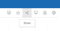
- Click on the Share button:
- In the pop-up box, copy and paste the Link URL and submit it on Canvas.