
Tableau Public II
Overview
The goal of today is to continue develop your comfort working with and analyzing data using Tableau Public. For the purposes of today, you’re going to be using a dataset that was made by some lame professor at CU Denver: 1871 Postmaster Salaries. This is a dataset that Prof. Blevins collected while researching the history of the US postal system in the American West during the late 1800s. This particular dataset contains information of every post office in the western United States in 1871 along with how much compensation its postmaster received from the federal government that year for operating the post office.
Get (to know) Your Data
- Download the file
1871 Postmaster Salaries.csvand save the file inside yourtableau-publicfolder on your computer. - The dataset is formatted as a Comma Seperated Values (.csv) file, a common form of tabular data that you can think of as a spreadsheet.
- Open Tableau Public and connect to the data source on your computer (ie. the
1871 Postmaster Salaries.csvfile you just downloaded). - Here is a little more info about the column names along with a few example rows:
| PO_Name | County | State | PM_Salary | Latitude | Longitude |
|---|---|---|---|---|---|
| Name of a post office (ie. a town, city, etc.) | The county where the post office was located | The state where the post office was located | The postmaster’s 1871 salary at that post office (in $) | Latitude coordinate (location) | Longitude coordinate (location) |
| Arizona | Yuma | AZ | 360 | 32.7253249 | -114.624397 |
| Ehrenburg | La Paz | AZ | 140 | 33.6041914 | -114.5252322 |
| Florence | Pinal | AZ | 12 | 33.0314508 | -111.3873431 |
| Fort Bowie | Cochise | AZ | 12 | 32.149804 | -109.4525624 |
Analyze Your Data
You’re going to make a series of new sheets in your workbook. Each sheet is going to pose a particular historical question about your dataset that you will need to answer by creating a data visualization.
Sheet 1
Question: Which western state has the second-most post offices?
- Create a bar chart with vertical columns illustrating the number of post offices in each state.
- Hint: Use the data field
1871-postmaster-salaries.csv (Count)- this allows you to count up all the records (rows) in a dataset or parts of a dataset
- Hint: Use the data field
- Sort the bar chart so that it is in descending order (ie. state with most post offices is on the left, the state with the fewest post offices is on the right)
- Add an annotation to the column on your chart corresponding to the state with the second-most post offices so that it says the name of the state.
Sheet 2
Question: which western counties received the highest total amount in postmaster salaries?
- Create a Treemap made up of individual counties, sized by the combined postmaster salaries of post offices in that county
- Make sure you’re using the
Measure Sum()aggregation for thePM_Salaryfield. - Add the
Statefield to the Color button on the Marks card so that counties are grouped and colored by their state - Add labels to the tree map that include: a) the name of the county, and b) the total combined postmaster salary for post offices in that county.
- Hint: You’ll need to drag multiple fields onto the Label button on the Marks card:
CountyandPM_Salary.
- Hint: You’ll need to drag multiple fields onto the Label button on the Marks card:
Sheet 3
Question: in which state did the average postmaster receive the highest salary?
- Put together the skills you learned in Sheet 1 and Sheet 2:
- Make a bar chart with each state as a vertical column
- Height of column correspond to average postmaster salary in that state
- Sorted in descending order (highest average salary on left, lowest on right)
- Each column has a label of the average postmaster salary in that state
- Columns colored according to the total (count) number of post offices in the state
- Add an annotation to the largest column that says:
"_____ has the highest average salary!"- fill in the blank with your answer.
Bonus: Sheet 4 (Optional)
Question: where were post offices located in each state?
- Create a dot map of every post office in the dataset.
- Hint: Use the
LongitudeandLatitudefields - not the ones that say (generated)
- Hint: Use the
- Use the Marks card to size the dots according to the postmaster salary at that post office - the larger the salary, the larger the dot.
- Use the Color button on the Marks card to adjust:
- Color: Green
- Opacity: 70%
- Border: Black
Save your workbook and Submit on Canvas
- Publish your Tableau Public workbook by going to File -> Save to Tableau Public and name it
Tableau Public II - Open up your Tableau Public workbook in a browser rather than the desktop app.
- Click the Settings (gear shape) icon and make sure the
Show Sheetoption is set to on:

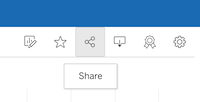
- Click on the Share button:
- In the pop-up box, copy and paste the Link URL and submit it on Canvas.