Making Numbers Legible
What do you do with numbers? I mean this in the context of writing, not research. How do you incorporate quantitative evidence into your writing in a way that makes it legible for your readers? I’ve been thinking more and more about this as I write my dissertation, which examines the role of the nineteenth-century Post in the American West. Much like today, the Post was massive. Its sheer size was part of what made it so important. And I find myself using the size of the Post to help answer the curmudgeonly “so what?” question that stalks the mental corridors of graduate students. On a very basic level, the Post mattered because so many Americans sent so many letters through such a large network operated by so many people. Answering the “so what?” question means that I have to incorporate numbers into my writing. But numbers are tricky.
Let’s begin with the amount of mail that moved through the U.S. Post. In 1880 Americans sent 1,053,252,876 letters. That number is barely legible for most readers. I mean this in two ways. In a mechanical sense we HATE having to actually read so many digits. A more conceptual problem is that this big of a number doesn’t mean all that much. If I change 1,053,252,876 to 1,253,252,876, would it lead you, the reader, to a fundamentally different conclusion about the size of the U.S. Post? I doubt it, even though the difference of 200 million letters is a pretty substantial one. And if instead of adding 200 million letters I subtract 200 million letters - 1,053,252,876 down to 853,252,876 - the reader’s perception is more likely to change. But this is only because the number shed one of its digits and crossed the magic cognitive threshold from “billion” to “million.” It’s not because of an inherent understanding of what those huge numbers actually mean.
One strategy to make a number like 1,053,252,876 legible is by reduction: to turn large numbers into much smaller ones. If we spread out those billion letters across the population over the age of ten, the average American sent roughly twenty-eight letters over the course of 1880, or one every thirteen days. A ten-digit monstrosity turns into something the reader can relate to. After all, it’s easier to picture writing a letter every two weeks than it is to picture a mountain of one billion letters. Numbers, especially big ones, are easier to digest when they’re reduced to a more personal scale.
1,053,252,876 letters / 36,761,607 Americans over the age of ten = 28.65 letters / person
A second way to make numbers legible is by comparison. The most direct corollary to the U.S. Post was the telegraph industry. Put simply, the telegraph is a lot sexier than the Post and both nineteenth-century Americans and modern historians alike lionized the technology. A typical account goes something like this: “News no longer traveled at the excruciatingly slow pace of ships, horses, feet, or trains. It now moved at 670 million miles per hour.” In essence, “the telegraph liberated information.” But the telegraph only liberated information if you could afford to pay for it. In 1880 the cost of sending a telegram through Western Union from San Francisco to New York was $2.50, or 125 times the price to mail a two-cent letter. Not surprisingly, Americans sent roughly 35 times the number of letters than telegrams. The enormous size of the Post was in part a product of how cheap it was to use.
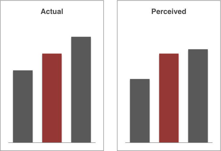
This points to a third strategy to make numbers legible: visualization. In the above case the chart acts as a rhetorical device. I’m less concerned with the reader being able to precisely measure the difference between $2.50 and $0.02 than I am with driving home the point that the telegraph was really, really expensive and the U.S. Post was really, really cheap. A more substantive comparison can be made by looking at the size of the Post Office Department’s workforce. In 1880 it employed an army of 56,421 postmasters, clerks, and contractors to process and transport the mail. Just how large was this workforce? In fact, the “postal army” was more than twice the size of the actual U.S. Army. Fifteen years removed from the Civil War there were now more postmasters than soldiers in American society. Readers are a lot better at visually comparing different bars than they are at doing mental arithmetic with large, unwieldy numbers.
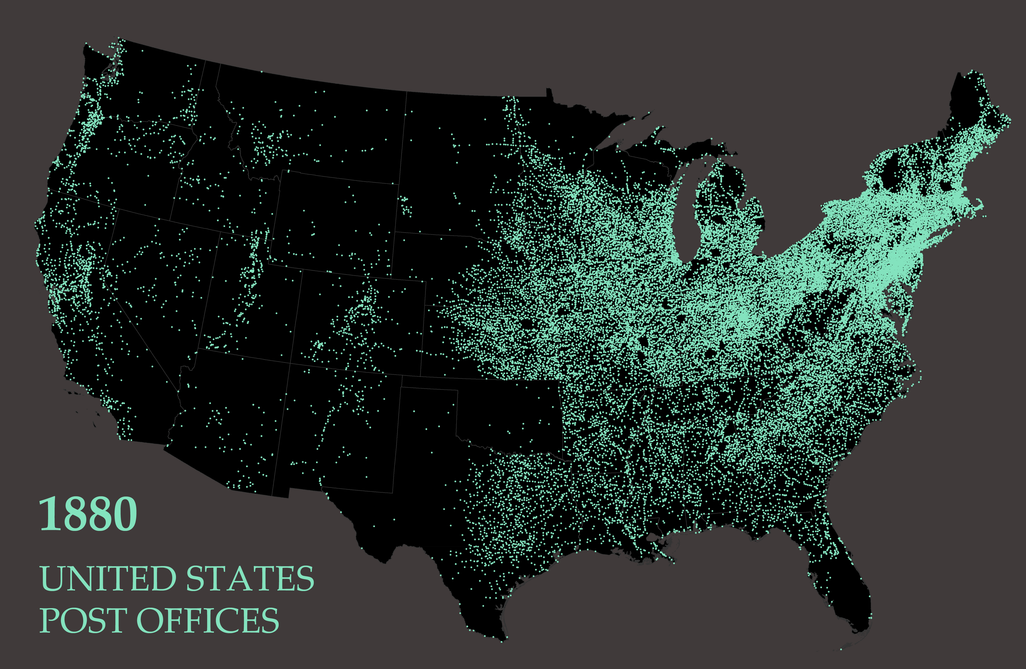
Almost as important as the sheer size of the U.S. Post was its geographic reach. Most postal employees worked in one of 43,012 post offices scattered across the United States. A liberal postal policy meant that almost any community could successfully petition the department for a new post office. Wherever people moved, a post office followed close on their heels. This resulted in a sprawling network that stretched from one corner of the country to the other. But what did the nation’s largest spatial network actually look like?
Mapping 43,012 post offices gives the reader an instant sense for both the size and scope of the U.S. Post. The map serves an illustrative purpose rather than an argumentative one. I’m not offering interpretations of the network or even pointing out particular patterns. It’s simply a way for the reader to wrap their minds around the basic geography of such a vast spatial system. But the map is also a useful cautionary tale about visualizing numbers. If anything, the map undersells the size and extent of the Post. It may seem like a whole lot of data, but it’s actually missing around ten thousand post offices, or 22% of the total number that existed in 1880. Some of those offices were so obscure or had such a short existence that I wasn’t able to automatically find their locations. And these missing post offices aren’t evenly distributed: about 99% of Oregon’s post offices appear on the map compared to only 47% of Alabama’s.
Disclaimers aside, compare the map to a sentence I wrote earlier: “Most postal employees worked in one of 43,012 post offices scattered across the United States.” In that context the specific number 43,012 doesn’t make much of a difference - it could just as well be 38,519 or 51,933 - and therefore doesn’t contribute all that much weight to my broader point that the Post was ubiquitous in the nineteenth-century United States. A map of 43,012 post offices is much more effective at demonstrating my point. The map also has one additional advantage: it beckons the reader to not only appreciate the size and extent of the network, but to ask questions about its clusters and lines and blank spaces.* A map can spark curiosity and act as an invitation to keep reading. This kind of active engagement is a hallmark of good writing and one that’s hard to achieve using numbers alone. The first step is to make numbers legible. The second is to make them interesting.


