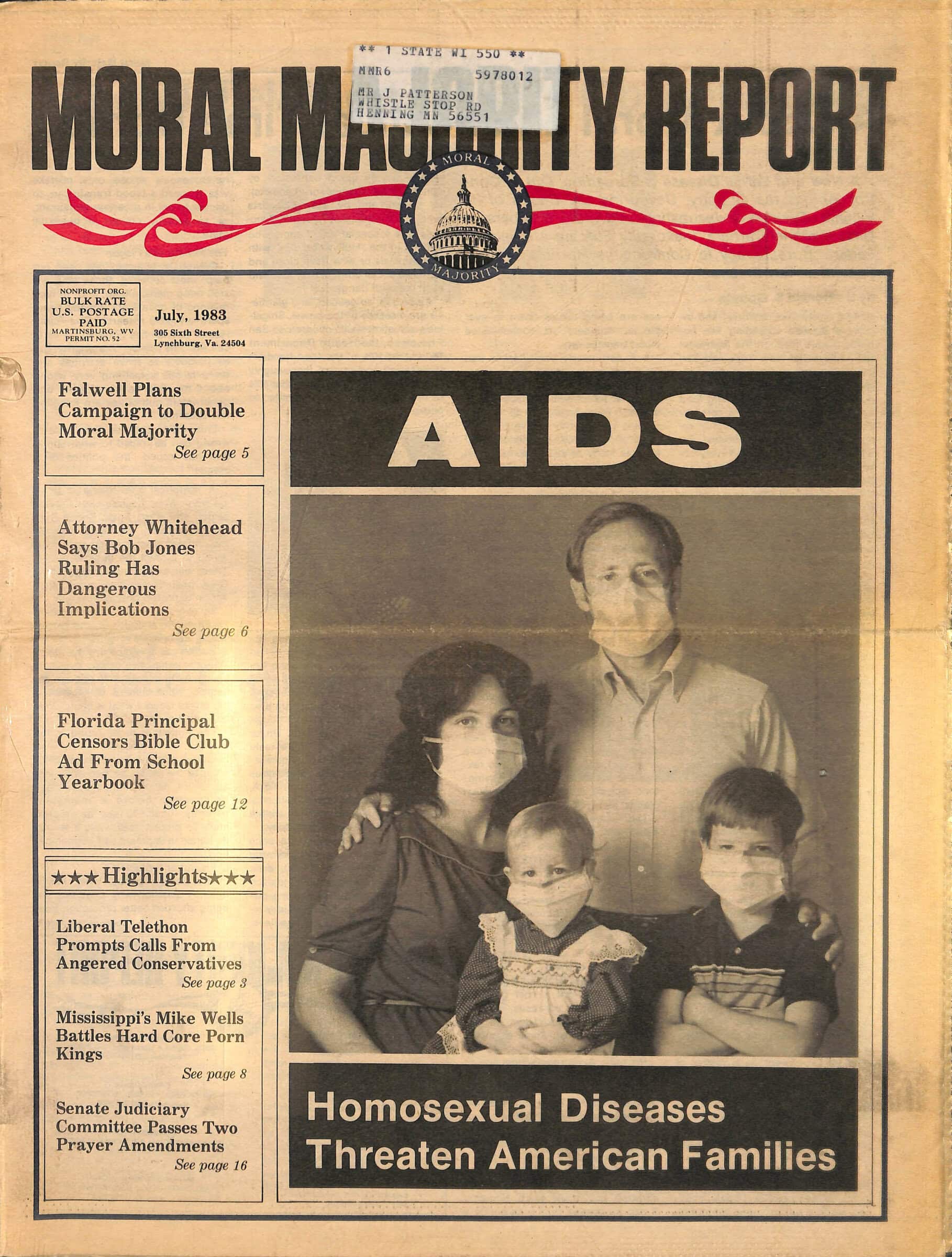
The American AIDS epidemic is one of the most notorious public health catastrophes of the 20th century. The dataset used in this analysis is anonymized patient data for those diagnosed with HIV/AIDS between 1981 and 2002, documenting 859,000 cases and 476,000 deaths nationwide. The start of 1981 marks the initial recognition of AIDS by the Center for Disease Control (CDC) and thus the beginning of AIDS data collection. The CDC reported on clusters of diseases related to immunosuppression which researchers referred to as "gay related immune deficiency" and the public labeled "gay cancer." Initially heavily stigmatized as a deadly result of being a gay man, it was quickly discovered in other groups including IV drug users, women, and those diagnosed with the blood clotting disorder hemophilia. I sought to explore the legitimacy of the connection of AIDS in the gay community through the subset of Denver cases, as there is no academic analysis of AIDS in Denver like there are of epicenters. I used a CDC dataset that includes statistical categories like sex, race, and exposure type. After importing the necessary libraries, we can pull a sample of the dataset below:
import pandas as pd
import matplotlib.pyplot as plt
aids_df=pd.read_csv('aids_combo.csv', delimiter=",")
aids_df.sample(5)
| count | month diagnosed | month | year | age at diagnosis | age at diagnosis code | sex | sexual orientation | sex and sexual orientation code | exposure category | exposure category code | vital status | vital status code | race or ethnicity | race or ethnicity code | cases | |
|---|---|---|---|---|---|---|---|---|---|---|---|---|---|---|---|---|
| 5099 | 5100 | 07-1998 | 7 | 1998 | 35 - 39 Years or age is missing | 6 | Male | homosexual or Unknown Classification | 1 | Male homosexual/bisexual contact | 1 | Alive: Not reported dead before 2001 | 0 | White (and also not Hispanic) | 2106-3 | 4 |
| 2354 | 2355 | 04-1992 | 4 | 1992 | 35 - 39 Years or age is missing | 6 | Male | homosexual or Unknown Classification | 1 | Male homosexual/bisexual contact | 1 | Dead: Reported dead before 2001 | 1 | White (and also not Hispanic) | 2106-3 | 7 |
| 3022 | 3023 | 04-1993 | 4 | 1993 | 45 - 49 Years | 8 | Male | homosexual or Unknown Classification | 1 | Male homosexual/bisexual contact | 1 | Alive: Not reported dead before 2001 | 0 | White (and also not Hispanic) | 2106-3 | 1 |
| 765 | 766 | 10-1988 | 10 | 1988 | 45 - 49 Years | 8 | Male | bisexual | 2 | Male homosexual/bisexual contact | 1 | Dead: Reported dead before 2001 | 1 | White (and also not Hispanic) | 2106-3 | 1 |
| 1285 | 1286 | 03-1990 | 3 | 1990 | 50 - 54 Years | 9 | Male | homosexual or Unknown Classification | 1 | Male homosexual/bisexual contact | 1 | Dead: Reported dead before 2001 | 1 | White (and also not Hispanic) | 2106-3 | 2 |
The dataset was collected by health care providers and provided to the CDC to track the epidemic. The dataset was made available through the CDC WONDER portal, a website offering medical datasets with the intent of encouraging public health research. There is a question of accuracy in that the diagnosis criteria, which pre-1985 was a variety of symptoms or conditions related to low immune response that may indicate AIDS infection. Thus, there is an uncertifiable possibility the data collected at the time could be inflated. The reported demographics could also be flawed, as large portion of the data is either self-reported or assumed by the healthcare provider. Those exposed to AIDS were incentivized to lie due to the illness being highly stigmatized. Furthermore, the dataset is likely incomplete due to people not knowing the symptoms of the illness well or not seeking help from entities that would report to the state due to the intense stigma that surrounded AIDS. Assumptions from the CDC were imposed on the medical practitioners, such as homosexual men being given the code “1” and being lumped with unknown sexuality, pediatric cases being lumped with heterosexual cases, with no consideration for the sexuality of female cases. This shows the CDC was bureaucratically reenforcing the stereotypes of AIDS, although it was known by 1982 that the HIV/AIDS epidemic was not isolated to homosexual men. The strangest assumption (to me, anyway) is "age is missing" is lumped with 35–39 years old, when the average AIDS patient was for Denver was 30–34. Of course, the national average was 35–39 but that's likely due to this odd categorization.
Due to privacy concerns, the original data had been amalgamated based on demographics before publishing. All cases with the same data were combined in one row, the number of combined cases is denoted by the “cases” column. For the purpose of analysis, I used an Excel macro to repeat each row the number of times provided in the cases column. Thus, each row of my modified dataset represents an individual case.
To gain insight into the applicability of the “gay white male AIDS victim” stereotype, I analyze the mortality and infection statistics for Denver cases through the following calculations and graphics.
To begin to analyze the case trends for Denver, we will plot the total number of cases over each month. As a point in comparison, I've pulled the total U.S. cases per month from the WONDER portal as well. We will overlay this with the Denver data.
aids_df['month diagnosed'] = pd.to_datetime(aids_df['month diagnosed'])
by_year=aids_df.groupby('month diagnosed')['count'].count()
us_df=pd.read_csv('cases per month.csv', delimiter=',')
us_df['month diagnosed']=pd.to_datetime(us_df['month diagnosed'])
us_cases=us_df.groupby('month diagnosed')['cases'].sum()

fig = plt.figure()
ax = fig.add_subplot(111)
ax2 = ax.twinx()


us_cases.plot(kind='line', color='teal', ax=ax, label='U.S.', legend=True, title= 'Cases Diagnosed by Month')
by_year.plot(kind='line', color='orange', ax=ax2, label='Denver', legend=True)

ax.set_ylabel('National Cases')
ax2.set_ylabel('Denver Cases')
plt.legend(loc=1, bbox_to_anchor=(1.01, 0.9))

plt.show()

At 6,062 cases recorded from 1981–2002, Denver was not spared from the AIDS epidemic. Although cases were less prevalent than U.S. trends at the start of the pandemic in 1981, they soon mirrored the national trends, such as with the spike in the early 1990s. Thus, Denver may serve as a valid case study for larger, harder to study national AIDS data sets. Of course, the first test for AIDS wasn't made available until 1985 and even then, it wasn't universally accessible. Therefore, these datasets of reported cases will never fully encapsulate the epidemic.
To begin an analysis of AIDS stereotyping in Denver specifically, let's take a look at the average Denver case.
aids_df.mode()[:1]
| count | month diagnosed | month | year | age at diagnosis | age at diagnosis code | sex | sexual orientation | sex and sexual orientation code | exposure category | exposure category code | vital status | vital status code | race or ethnicity | race or ethnicity code | cases | |
|---|---|---|---|---|---|---|---|---|---|---|---|---|---|---|---|---|
| 0 | 1 | 1992-12-01 | 6.0 | 1992.0 | 30 - 34 Years | 5 | Male | homosexual or Unknown Classification | 1.0 | Male homosexual/bisexual contact | 1.0 | Dead: Reported dead before 2001 | 1.0 | White (and also not Hispanic) | 2106-3 | 1.0 |
As can be seen above, the average Denver case was in fact a white male aged 30-34 who was reported as homosexual or of unknown sexuality and was allegedly exposed to HIV though homosexual contact. The graph below depicts the trend of each exposure type over time. Notice how homosexual contact dominates the graph and creates a pattern strikingly similar to the trend of all cases from above.
 ecdf = (aids_df.reset_index()
          .groupby(['month diagnosed','exposure category'], as_index=False)
          .count()
          .rename(columns={'index':'ct'})
       )
fig, ax = plt.subplots()
for key, data in ecdf.groupby('exposure category'):
    data.plot(x='month diagnosed', y='ct', ax=ax, label=key, title='Cases Per Exposure over Time')
plt.legend(loc=1, bbox_to_anchor=(1.75, 0.9))
<matplotlib.legend.Legend at 0x7fa7b329cee0>

The origin of AIDS being seen as a gay disease is apparent in this graph, given the disproportionate number of homosexual cases. In fact, exposure categories aside from homosexual contact are barely represented. However, it is important to remember we don't know how exposure was reported and, given the stigma associated with the illness, it isn't difficult to imagine some reporting providers may have simply assumed homosexuality.
AIDS arguably remains prolific in our collective memory due to how deadly it was. The most tragic, though not necessarily surprising, aspect of this data is that the average patient in Denver died. Survivor Daniel Renner recently recalled losing "79 friends and lovers" to AIDS after moving to Denver in 1990. When Renner arrived in Denver, an AIDS diagnosis was all but a death sentence, as shown below in a graph of mortality rate over time.
mortality=aids_df['vital status code']== 1
by_year_mort=aids_df[mortality].groupby('month diagnosed')['count'].count()
precent_mort=by_year_mort/by_year*100
precent_mort.plot(title= 'Mortality Rate by Month')
import datetime as dt
plt.axvline(dt.datetime(1987, 3, 19), color='green',)
plt.axvline(dt.datetime(1997, 11, 20), color='green',)
<matplotlib.lines.Line2D at 0x7fa7b01dfc10>

The mortality rate depicts a steady decline, this is due to AIDS becoming more treatable as treatment methods were discovered and approved. Important milestones in AIDS treatment include the approval of AZT, an antiretroviral medication in 1987 and the use of AZT beginning at time of exposure to HIV to stop HIV from progressing to AIDS in 1997 (denoted by the green lines on the graph). It’s popularly believed gay men were the most likely to die from AIDS given the association between AIDS and the gay community. However, when mortality rate is analyzed by demographic, interesting trends appear. For example, when we calculate mortality rate by exposure type...
exposure_total=aids_df.groupby('exposure category')['count'].count()
exposure_mortality=aids_df[mortality].groupby('exposure category')['count'].count()
exposure_mortality_prec=exposure_mortality/exposure_total*100
exposure_mortality_prec.sort_values(ascending=False).plot(title= 'Exposure Precent Mortality', kind='bar', color='purple')
<AxesSubplot:title={'center':'Exposure Precent Mortality'}, xlabel='exposure category'>

...we can see those exposed to AIDS through blood components and hemophilia have significantly higher mortality rates than homosexual contact. One might recall the now famous AIDS diagnosis of hemophiliac Ryan White, who was banned from attending school and became a poster child for AIDS research following his death in 1990. Even though they have the highest mortality, hemophiliacs and transfusion recipients make up a mere .7% of the total cases each, while homosexual contact made up a whopping 71% of total cases. This illustrates how the stereotype of AIDS killing gays was likely influenced by the sheer case numbers for homosexual contact, not mortality.
Interesting trends also appear in mortality by race. The code below calculates and graphs the percentage of the total cases and total deaths for each race category.
deaths=aids_df[mortality]['count'].count()
total=aids_df['count'].max()
race_mortality=aids_df[mortality].groupby('race or ethnicity')['count'].count()
race_mortality_prec=race_mortality/deaths*100
race_total=aids_df.groupby('race or ethnicity')['count'].count()
race_prec=race_total/total*100

fig = plt.figure()
ax = fig.add_subplot(111)

race_prec.plot(kind='bar', color='teal', ax=ax, label= '% of Total Cases', position=1, legend=True, title='% of Cases and Deaths by Race')
race_mortality_prec.plot(kind='bar', label= '% of Total Deaths', color='black', ax=ax, position=0, legend=True)
<AxesSubplot:title={'center':'% of Cases and Deaths by Race'}, xlabel='race or ethnicity'>

But there are some oddities. When viewing the number of cases and the number of reported deaths, the percent mortality should sit at about 57%. However, when only viewing the percent of each race that died when compared to the total number of cases for that race, odd trends sprout up...
The mortality rate for White cases is considerably higher than the other races and inflates the average, 3 of the 5 race designations have a mortality rate of 45% except for Natives and Whites. This is especially interesting when one considers what a small number of Natives were diagnosed with AIDS in Denver (.3% of cases, 42 cases total) which is possibly indictive of substandard access to medical care.
Similarly, mortality rate changes with age. It comes to no surprise to anyone in the COVID era that mortality rate is higher with age, although there are interesting variations in what one would expect to be a worsening mortality rate with age. Notice the 30–39 range is extremely close to the overall mortality rate of 57%. This variation is difficult to quantify. The odd uptick at about 20–39 might just be due to the overwhelming number of cases in that age range. It could also be affected by preexisting conditions in individual cases, inflating mortality rates at younger ages.
age_total=aids_df.groupby('age at diagnosis')['count'].count()
age_mort=aids_df[mortality].groupby('age at diagnosis')['count'].count()
age_mort_prec=age_mort/age_total*100
age_mort_prec.plot(kind='bar', color='green')
<AxesSubplot:xlabel='age at diagnosis'>

It’s easy to see where the stereotype of AIDS primarily affecting White gay men originated, given the sheer number of cases in that demographic. While White homosexual men did make up most of the cases and deaths, they were not the only demographics affected. However, AIDS was far more deadly to those reliant on blood transfusions than to gay men and changed drastically based on age. Thus, while gay men were disproportionately affected by the AIDS epidemic, the stigma of AIDS being a gay illness is not warranted by the data given the deadly consequences of AIDS even to those outside of the gay community. Of course, this analysis is far from exhaustive, and arguments can be made the nature of the dataset is shaky in terms of accuracy. But it is one of the few datasets from the era itself and offers some insight into the progression of the Denver AIDS epidemic as well as how it was viewed and categorized at the time.